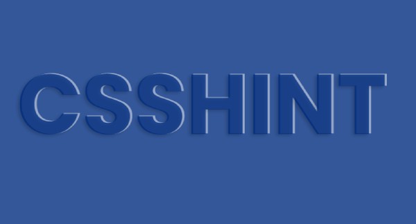
Check Out this animated gradient text effect in pure CSS designed by Shaw.
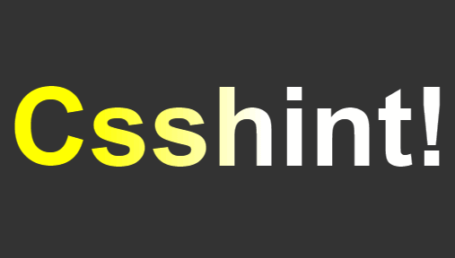
Animated Gradient Text Effect
HTML
[code language=”html”]
<h1 class="linear-wipe">Csshint.com!</h1>
[/code]
CSS / LESS
[code language=”css”]
html { height: 100%; }
body {
background: #333;
text-align: center;
min-height: 100%;
display: flex;
justify-content: center;
align-items: center;
}
h1 { font-size: 20vw; }
.linear-wipe {
text-align: center;
background: linear-gradient(to right, #FFF 20%, #FF0 40%, #FF0 60%, #FFF 80%);
background-size: 200% auto;
color: #000;
background-clip: text;
text-fill-color: transparent;
-webkit-background-clip: text;
-webkit-text-fill-color: transparent;
animation: shine 1s linear infinite;
@keyframes shine {
to {
background-position: 200% center;
}
}
}
[/code]