This Amazing Rounded Button Checkbox Glide Toggle using css. This cool snippets designed by Zed Dash a codepen user.
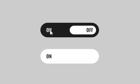
Rounded Button Checkbox using css
The Html
[code language=”html”]
<span class="switcher switcher-1">
<input type="checkbox" id="switcher-1">
<label for="switcher-1"></label>
</span>
<span class="switcher switcher-2">
<input type="checkbox" id="switcher-2">
<label for="switcher-2"></label>
</span>
[/code]
CSS / SCSS
[code language=”css”]
$black:#1E1E1E;
$grey:#CCCCCC;
$white:#FFFFFF;
body {
display:flex;
flex-direction:column;
align-items:center;
justify-content:center;
height:100vh;
background-color:$grey;
span.switcher {
position: relative;
width:200px;
height:50px;
border-radius:25px;
margin:20px 0;
input {
appearance: none;
position: relative;
width:200px;
height:50px;
border-radius:25px;
background-color:$black;
outline:none;
font-family: ‘Oswald’, sans-serif;
&:before, &:after {
z-index:2;
position: absolute;
top:50%;
transform:translateY(-50%);
color:$white;
}
&:before {
content: ‘ON’;
left:20px;
}
&:after {
content: ‘OFF’;
right:20px;
}
}
label {
z-index:1;
position: absolute;
top:10px;
bottom:10px;
border-radius:20px;
}
&.switcher-1 {
input {
transition:.25s -.1s;
&:checked {
background-color:$white;
&:before {
color:$white;
transition: color .5s .2s;
}
&:after {
color:$grey;
transition: color .5s;
}
&+label {
left:10px;
right:100px;
background:$black;
transition: left .5s, right .4s .2s;
}
}
&:not(:checked) {
background:$black;
transition: background .5s -.1s;
&:before {
color:$grey;
transition: color .5s;
}
&:after {
color:$black;
transition: color .5s .2s;
}
&+label {
left:100px;
right:10px;
background:$white;
transition: left .4s .2s, right .5s, background .35s -.1s;
}
}
}
}
&.switcher-2 {
overflow:hidden;
input {
transition:background-color 0s .5s;
&:before {
color:$black;
}
&:after {
color:$white;
}
&:checked {
background-color:$white;
&+label {
background:$white;
animation: turn-on .5s ease-out;
@keyframes turn-on {
0% {
left:100%;
}
100% {
left:0%;
}
}
}
}
&:not(:checked) {
background:$black;
&+label {
background:$black;
animation: turn-off .5s ease-out;
@keyframes turn-off {
0% {
right:100%;
}
100% {
right:0%;
}
}
}
}
}
label {
top:0px;
width:200px;
height:50px;
border-radius:25px;
}
}
}
}
[/code]